Your address will show here +12 34 56 78
CRO

TL;DR: The average Shopify health and wellness store converts at just 1.4–1.8%, while the top 10% break past 4.7%. The difference isn’t traffic — it’s product page design. High-converting PDPs for supplement and wellness DTC brands share specific elements: outcome-driven headlines instead of product names, ingredient transparency with dosage and sourcing details, layered social proof (reviews, UGC, certifications, press mentions), strategic subscription and bundle offers, trust signals like third-party testing and GMP badges, mobile-first UX with sticky add-to-cart, and structured content that guides comparison shoppers toward purchase. This guide breaks down each element with data, frameworks, and a real-world product page audit of Wild Roman (a men’s skincare brand) to show exactly what to optimize. If you’re a health and wellness brand doing $1M–$10M and your PDP conversion rate is under 3%, start with the CRO priority matrix at the end of this post.


Most supplement product pages look the same. Stock photo of a tub. A wall of bullet points. An “Add to Cart” button. And a conversion rate hovering somewhere around 1.5%.

Here’s the uncomfortable truth: the average Shopify store converts at just 1.4–1.8% of visitors into buyers. The top 20% of stores hit 3.2% or higher, and the top 10% break past 4.7%. In personal care and supplements specifically, the industry benchmark sits around 6.8% — meaning there’s a massive gap between where most brands are and where they could be.

That gap isn’t about traffic. It’s about what happens after someone lands on your product page.

The health and wellness DTC brands winning right now — the ones scaling past seven figures — have stopped treating their product detail pages (PDPs) like catalog entries. They’re treating them like conversion-optimized landing pages, where every element is deliberately placed to move a skeptical, comparison-shopping buyer toward a purchase.

This guide breaks down exactly what that looks like. We’ll cover the must-have elements, the psychology behind each one, and the data that proves they work. And to make this tangible, we’ll walk through a real-world product page audit of a men’s skincare brand to show you what we’d actually flag and fix if this were a Forge Digital Marketing client engagement.

Let’s get into it.


Lead With Outcome-Driven Headlines, Not Product Names

The first thing a visitor sees on your product page sets the frame for everything that follows. And most supplement brands waste that real estate on the product name alone.

“Creatine Monohydrate 300g” tells someone what the product is. “Fuel Your Best Workout Every Single Day” tells them what it does for them. That distinction is the difference between a product page that reads like a warehouse label and one that makes someone feel like they’re about to solve a problem.

This isn’t just branding theory. Conversion research consistently shows that benefit-led headlines outperform feature-led headlines on product pages, particularly in categories where customers are comparing multiple similar options — which describes every supplement vertical.

Headline Frameworks That Work for Supplements

The best performing health and wellness PDPs we’ve seen use one of three frameworks:

The Outcome Statement: Lead with the end result the customer wants. “Recover Faster. Train Harder. Come Back Stronger.” This works well for pre-workout, post-workout, and recovery products where the buyer has a clear performance goal.

The Problem-Solution Frame: Call out the specific frustration and position the product as the answer. “Tired of Crashing at 2pm? Clean Energy That Actually Lasts.” This works for energy supplements, adaptogens, and nootropics where the buyer is motivated by a pain point.

The Identity Headline: Speak to who the buyer wants to be. “Built for Athletes Who Don’t Take Days Off.” This works for health and wellness brands with a strong community and lifestyle angle — it turns the product into a badge of belonging.

Matching Language to Audience Goals

The language your headline uses should mirror the specific goal your target customer has. A protein powder buyer focused on muscle gain responds to words like “build,” “grow,” “maximize,” and “gains.” A recovery supplement buyer responds to “repair,” “bounce back,” “reduce soreness,” and “recover.” A weight management buyer responds to “lean,” “burn,” “metabolism,” and “define.”

When you match headline language to the precise intent that brought someone to the page, you reduce the cognitive gap between “what I’m looking for” and “what I’m seeing.” That alignment is what makes someone scroll instead of bounce.

Real-World Audit: Wild Roman Face Serum

To show what this looks like in practice, let’s look at Wild Roman (wildroman.com), a men’s skincare brand selling a bakuchiol-based face serum. Their product page headlines the product as simply “FACE SERUM” — that’s it. The product name, no outcome, no benefit statement, no hook.

Wild Roman Face Serum product page hero section showing the FACE SERUM headline, benefit bar, 5-star rating with 3 reviews, Subscribe and Save toggle, and ADD TO CART button. Wild Roman’s Face Serum PDP — the headline leads with the product name rather than an outcome-driven benefit statement.

Underneath, they include a benefit bar that reads “ANTI-AGING • REDUCES WRINKLES • FIRMS & MOISTENS • IMPROVES SKINTONE.” These are strong claims — but they’re buried in a secondary line rather than leading the page. A visitor scanning quickly might not even register them.

If this were a Forge Digital Marketing engagement, our first recommendation would be to elevate that benefit messaging into the H1. Something like “The Anti-Aging Face Serum That Actually Works — Without Retinol” would immediately differentiate, call out a benefit, and address the objection that bakuchiol is a less effective retinol alternative. The product name “Face Serum” can still live on the page — it just shouldn’t be the thing doing the heavy lifting.


Ingredient Transparency Is a Conversion Tool

In 2026, supplement buyers are more informed and more skeptical than ever. They read labels. They Google ingredients. They cross-reference dosages with clinical studies. If your product page doesn’t meet that level of scrutiny, you lose the sale to someone who does.

Ingredient transparency isn’t just a regulatory best practice — it’s one of the most underutilized conversion levers on a supplement product page. When done right, it builds the kind of trust that turns a first-time browser into a buyer without them needing to leave your site to do their own research.

Supplement Facts Panels With Clear Dosing

The supplement facts panel should be easy to find, easy to read, and presented as a selling point rather than a compliance obligation. Top-converting brands display their full panel prominently on the PDP — not buried in a collapsible tab or hidden behind a “View Ingredients” link that requires an extra click.

Transparent dosing matters especially in supplements and wellness, where educated buyers know the difference between clinical doses and “fairy dusting” (including an ingredient at a fraction of the effective dose just to put it on the label). If your product uses clinical doses, say so explicitly. “500mg of KSM-66 Ashwagandha — the clinically studied dose” is far more compelling than just listing “Ashwagandha extract” in a panel.

“Why This Ingredient” Explainers

One of the highest-impact additions we recommend to supplement PDPs is a “Why This Ingredient” section that sits near the product description — ideally above the fold or immediately below it. This section should answer three questions for each key ingredient: what it is, what it does, and why it’s in this specific formula.

This serves multiple purposes. First, it educates the buyer and reduces the need for them to leave your site to research. Every time a customer leaves your page to Google an ingredient, you risk losing them to a competitor’s content. Second, it builds authority — you’re positioning your brand as one that understands the science, not just one that sells powder in a tub. Third, it creates SEO-rich content that helps your PDP rank for ingredient-specific queries like “bakuchiol benefits” or “sea buckthorn oil for skin.”

Third-Party Testing Badges and What They Signal

Third-party certifications — NSF Certified for Sport, Informed Sport, USP Verified, GMP Certified — are trust accelerators. Research shows that trust signals on product pages can increase conversion rates significantly, particularly for first-time buyers who don’t yet have a relationship with your brand.

The key is placement and prominence. These badges should appear near the product description and the add-to-cart button — not in the footer. A badge that a customer has to scroll past four screens to find isn’t doing its job.

Real-World Audit: Wild Roman’s Ingredient Presentation

Wild Roman’s Face Serum page includes a “Key Ingredients” section with visual cards for Sea Buckthorn Berry Oil, Pumpkin Seed Oil, Bakuchiol, and Camellia. Each card has a “Learn More” button, plus there’s a “View Ingredient List” option.

Wild Roman Key Ingredients section showing individual cards for Sea Buckthorn Berry Oil, Pumpkin Seed Oil, Bakuchiol, and Camellia with Learn More buttons. Wild Roman’s ingredient cards are visually appealing — but buried deep below the fold where most buyers never scroll. This is genuinely better than most — they’re naming their ingredients and signaling that there’s depth behind each one.

However, there are two issues. First, this section is buried deep on the page — below the cross-sell section, below the usage instructions, well below the fold. A first-time buyer comparing this serum to three competitors is making their decision in the first 15–20 seconds on the page. By the time they scroll to the ingredient cards, the purchase decision might already be lost.

Second, the product description near the top of the page is a dense paragraph block. It mentions bakuchiol as a “plant-based retinol alternative” and references clinical backing, but the formatting makes it easy to skim past. Breaking this into scannable bullet points or a short “What’s Inside and Why” section near the buy box would let the ingredient story do conversion work where it matters most — near the purchase decision point.


Social Proof That Actually Moves the Needle

If there’s one element that separates high-converting supplement pages from everyone else, it’s social proof — and specifically, the depth and format of that social proof.

The data on this is overwhelming. Products with five or more reviews see up to 270% higher conversion rates compared to products with zero reviews. Products with 11–30 reviews convert at 68% higher rates than those with none. And 98% of consumers say they read reviews before making a purchase. In health and wellness specifically, where buyers are putting a product on or in their body and trusting a brand with their health, review volume and quality is arguably more important than any other category in ecommerce.

Yet the majority of supplement product pages treat reviews as an afterthought — a small star rating in the corner, maybe a handful of text reviews below the fold, and no strategy for generating more.

Photo and Video Reviews vs. Text-Only

Not all reviews are created equal. User-generated content — real photos and videos from actual customers — drives dramatically higher conversion rates than text-only reviews. According to Emplifi’s Q3 2025 data, UGC-based social posts drive 10.38x higher conversion rates than non-UGC content. Websites featuring user-generated content see 29% higher conversion rates overall, and visitors who interact with UGC convert at 161% higher rates.

Video testimonials specifically deliver around 80% higher conversion uplift compared to text reviews alone. In health and wellness DTC, where customers want to see real people with real results, video reviews showing before-and-after progress, routine demos, or genuine product reactions are incredibly powerful trust builders.

The takeaway is clear: if your review section is text-only, you’re leaving money on the table. Invest in a review platform that supports photo and video uploads (Stamped, Okendo, Junip, and Yotpo all offer this), and actively incentivize customers to submit visual reviews through post-purchase email flows.

UGC Integration and Athlete Endorsement Placement

Beyond the review section, UGC should be woven throughout the product page. A lifestyle photo gallery showing real customers using the product, an Instagram feed integration, or a carousel of athlete endorsements creates a visual proof layer that reinforces the buying decision at multiple scroll points.

The placement of endorsements matters. An athlete endorsement that sits at the very bottom of the page after the FAQ has almost no impact on the purchase decision. That same endorsement placed in the hero section or immediately after the product description can dramatically shift perception and trust.

Star Ratings, Review Counts, and Verification

A few nuances that matter:

Review count visibility drives confidence. “4.8 stars from 847 reviews” carries exponentially more weight than “4.8 stars from 3 reviews.” If you’re early-stage and don’t yet have volume, prioritize review generation aggressively through post-purchase flows, incentivized review programs, and even product seeding to get past the critical threshold of 30+ reviews.

“Verified Buyer” tags matter. Consumers are increasingly savvy about fake reviews, and the “Verified Buyer” label adds a layer of authenticity that generic reviews lack. Make sure your review platform supports and displays this.

Review filtering and sorting let customers self-select the most relevant social proof. If a buyer can filter reviews by “athletic performance” or “recovery” or see reviews from people with similar goals, the relevance of that social proof increases dramatically.

Real-World Audit: Wild Roman’s Social Proof

This is the most significant CRO gap on Wild Roman’s Face Serum page. The product displays a 5-star rating with “(3) Reviews” near the top — but there is no dedicated reviews section anywhere on the page.

Wild Roman's buy box showing the 5-star rating with only (3) Reviews next to the product headline — the biggest conversion gap on this page. Only 3 reviews on a “Best Seller” product — a critical trust gap that likely costs conversions on every visit. We scrolled the entire PDP from top to bottom, past the cross-sells, past the ingredient cards, past the FAQ, and found no review widget, no customer testimonials, no UGC, and no photo reviews.

Three reviews on a product labeled “BEST SELLER” is a critical trust gap. A potential buyer seeing “Best Seller” next to “(3) Reviews” is going to immediately question that claim. If this is truly their top-performing product, generating review volume should be the single highest-priority CRO initiative for this brand.

Our recommendations here would be aggressive:

  1. Implement a dedicated review widget (Okendo or Stamped for Shopify) with photo and video upload support, placed prominently below the product description and above the cross-sell sections.
  2. Launch a post-purchase email flow requesting reviews at day 14 and day 30 (timed to when a face serum user would start seeing results), with a photo/video incentive (10% off next order for a review with a photo).
  3. Add a UGC carousel or testimonial block in the upper portion of the page, ideally between the product description and the ingredient section.
  4. Seed the product with 20–30 micro-influencers or existing customers in exchange for honest video reviews, then feature the best ones on the PDP.

The difference between 3 text reviews and 50+ photo/video reviews could easily double this page’s conversion rate based on the benchmarks we cited above.


Mobile-First Design Is Non-Negotiable

Over 70% of ecommerce traffic now comes from mobile devices. In health and wellness DTC ecommerce, that number skews even higher — your buyer is scrolling Instagram, sees an ad, and lands on your product page on their phone. If that mobile experience isn’t optimized, you’ve already lost them.

The data backs this up starkly. Mobile conversion rates average around 2.9% compared to 4.8% on desktop — nearly a 40% gap. A one-second delay in mobile page load causes a 20% drop in conversions. And 53% of mobile visitors abandon a page entirely if it takes more than three seconds to load.

This means your product page isn’t just a desktop page that “also works on mobile.” It needs to be designed mobile-first, where every element is optimized for a thumb-scrolling, distraction-prone, impatient shopper.

Sticky Add-to-Cart Bars and Thumb-Friendly Layouts

A sticky add-to-cart bar that follows the user as they scroll is one of the simplest, highest-ROI mobile CRO improvements you can make. When a buyer is reading your reviews or ingredient section halfway down the page and decides they want to purchase, they shouldn’t have to scroll back to the top to find the buy button. The sticky bar keeps the conversion action accessible at all times.

Best practices for sticky bars on supplement pages:

  • Include the product name, price, and a prominent “Add to Cart” button.
  • If you offer subscribe-and-save, include a toggle or badge on the sticky bar.
  • Keep it slim — it should be helpful, not obstructive to the browsing experience.
  • Ensure the bar only appears after the user scrolls past the primary add-to-cart button, so it supplements rather than duplicates.

Beyond the sticky bar, your entire layout should be designed for thumb zones. Primary CTAs should sit in the natural thumb-reach zone (center-bottom of the screen). Image galleries should support swipe navigation. Accordions and collapsible sections keep the page manageable without losing content depth.

Image Gallery Optimization for Mobile

Your product images are doing heavy lifting on mobile, where the user can’t easily open multiple tabs to compare or read dense text. Mobile image galleries should include:

  • A hero lifestyle image as the first image (person using the product, not just the product on a white background).
  • Swipe-enabled gallery with clear dot indicators showing how many images are available.
  • Pinch-to-zoom functionality for supplement facts panels and ingredient lists.
  • At least one “in-context” image showing the product size relative to a hand or common object.
  • A video slide (product demo or quick testimonial) embedded in the gallery.

Page Speed Benchmarks

Page speed directly correlates with conversion rate, and the relationship is not linear — it’s exponential. Pages that load in 2.4 seconds see conversion rates around 1.9%, while pages that take 5.7 seconds or longer drop to just 0.6%. That’s a 3x difference driven entirely by load time.

For Shopify supplement stores, the most common speed killers are:

  • Uncompressed product images (especially hero images over 1MB).
  • Third-party app scripts loading synchronously (review widgets, popup tools, analytics).
  • Custom fonts loading from external servers.
  • Video embeds loading on page render rather than on scroll.

Run your product pages through Google PageSpeed Insights and aim for a mobile performance score of 70+. Every point below that is costing you conversions.

Real-World Audit: Wild Roman’s Mobile Experience

Wild Roman’s product page includes image gallery thumbnails, but they’re positioned below the fold on what appears to be a relatively standard Shopify theme layout. We didn’t observe a sticky add-to-cart bar during our audit — meaning a mobile user who scrolls down to read the FAQ or ingredient section has to scroll all the way back to the top to purchase.

Wild Roman trust badges — All Natural Ingredients, No Preservatives or Harsh Chemicals, No Artificial Anything, and Crafted in USA — positioned below the image gallery. Strong trust signals, but placed too far below the buy button to influence the purchase decision.

The trust badges (All Natural Ingredients, No Preservatives or Harsh Chemicals, No Artificial Anything, Crafted in USA) are also positioned below the fold, underneath the image gallery thumbnails. On mobile, these would be even further down, well past the initial scroll view. Moving these badges directly beneath the add-to-cart button — or even integrating them as small icons next to the price — would put them where they can actually influence the purchase decision.

One positive note: Wild Roman does display Shop Pay installments ($24.50 per payment), which is smart for a $78 product. Installment messaging near the price point reduces sticker shock, particularly on mobile where impulse-purchase behavior is higher.


Subscription and Bundle Options at the Point of Purchase

For health and wellness DTC brands, the subscribe-and-save model isn’t just a nice-to-have — it’s the single most important lever for building lifetime value and creating predictable recurring revenue. Yet most brands bury their subscription option or present it as an afterthought instead of the default.

Subscribe-and-Save as a Default, Not a Hidden Toggle

The highest-converting supplement PDPs we’ve worked with present subscribe-and-save as the default selection — with one-time purchase as the alternative. This is a subtle but powerful framing shift. Instead of asking the customer to opt into a subscription, you’re giving them the option to opt out. The psychology of defaults is well-documented: people tend to stick with whatever is pre-selected, especially when there’s a clear financial incentive (like 10–20% off).

The subscription option should clearly communicate:

  • The exact discount (e.g., “Save 20% with Subscribe & Save”).
  • The delivery cadence and how it maps to the product’s usage cycle.
  • The flexibility to skip, pause, or cancel at any time.
  • What the per-delivery price will be.

Bundle Builders and “Stack” Recommendations

Bundles serve two purposes: they increase average order value (AOV) and they introduce customers to complementary products they might not have discovered otherwise. For wellness brands, the concept of routine-building (combining a cleanser + serum + moisturizer, or a pre-workout + protein + recovery stack, for example) is already native to how the audience thinks about their purchases.

Effective bundle presentation on a PDP includes:

  • A “Complete the Stack” or “Build Your Routine” section with curated bundles.
  • Clear pricing that shows the per-product savings vs. buying individually.
  • A “Most Popular” or “Staff Pick” tag on the recommended bundle to reduce decision fatigue.
  • One-click add-to-cart for the entire bundle.

How to Frame Savings Without Cheapening the Brand

This is where many brands get it wrong. Aggressive discounting (“50% OFF!!!”) cheapens perceived quality — especially in supplements, where price is often a proxy for quality and purity. Instead, frame savings as smart purchasing:

  • “Subscribe and get 20% off every order” (rewards loyalty, not desperation).
  • “Buy the full routine and save $24” (positions the bundle as the smart choice, not the cheap choice).
  • “Members save 15% on every order — plus free shipping” (frames the subscription as a membership with privileges).

Real-World Audit: Wild Roman’s Subscription and Bundle Presentation

Wild Roman handles this relatively well. Their product page presents a clear toggle between “Subscribe & Save (20% off)” and “One-Time Purchase,” with the subscription option showing the discounted price ($78.40 vs. $98.00). They also offer delivery frequency options of 45, 60, or 75 days, which is a smart approach for a skincare product where usage cadence varies.

Wild Roman Complete the Routine cross-sell section showing Face Wash and Face Moisturizer as complementary products. Wild Roman’s “Complete the Routine” cross-sell — a strong bundle concept that could be elevated higher on the page with savings callouts.

Their “Complete the Routine” cross-sell section is also effective — it shows the Face Wash ($42) and Face Moisturizer ($42) as complementary products. And further down, a “You May Also Like” section features their Face Routine bundle at $164, tagged as “BEST SELLER.”

There’s room for improvement, though. The delivery frequency options could benefit from a small helper line like “A 1 oz bottle typically lasts 45–60 days” to help first-time buyers select the right cadence with confidence. And the routine bundle could be elevated higher on the page with a savings callout (e.g., “Save $18 vs. buying separately”) to make the value proposition immediately clear.


Clear CTAs and Friction Reduction

The final — and arguably most important — conversion layer is reducing every possible point of friction between “I want this” and “I bought this.” Even small friction points compound. A confusing CTA, a missing trust signal near the buy button, or too many choices at checkout can each shave off a percentage of conversions. In aggregate, they can cut your conversion rate in half.

One Primary CTA Per Section

Decision fatigue is real, and it’s measurable. When a buyer is presented with too many options or actions simultaneously, they’re more likely to choose none. Your product page should have one clear primary CTA in the purchase area: “Add to Cart” or “Subscribe & Save.”

Secondary CTAs (like “Learn More,” “View Ingredients,” or “Read Reviews”) can exist on the page, but they should be visually subordinate to the primary purchase action. Different button sizes, colors, and weights create a clear visual hierarchy that guides the buyer toward the action you most want them to take.

Trust Signals Near the Buy Button

The moment of purchase is the moment of highest anxiety. “Is this legit?” “Will it work?” “What if I don’t like it?” These objections fire in the buyer’s mind right as their thumb hovers over “Add to Cart.” The antidote is placing trust signals directly adjacent to the buy button:

  • Shipping information: “Free shipping on orders over $50” or “Ships within 24 hours.”
  • Return/guarantee policy: “30-day money-back guarantee” or “Love it or your money back.”
  • Security badges: SSL seal, accepted payment icons, Shop Pay / Apple Pay logos.
  • Social proof micro-element: “Trusted by 10,000+ athletes” or the star rating with review count.

These signals don’t need to be large or verbose — a single line of small text or a row of icons directly below the Add to Cart button is enough. The goal is to defuse objections at the exact moment they arise.

Reducing Decision Fatigue

Supplement product pages often suffer from option overload. Multiple flavors, sizes, subscription cadences, and bundle options can overwhelm a buyer who just wants to try the product. The best-converting pages address this by:

  • Pre-selecting the most popular variant (size, flavor, or subscription cadence).
  • Using “Most Popular” or “Recommended” tags on specific options.
  • Limiting visible options to 3–4 choices and hiding the rest behind an expandable menu.
  • Using comparison text like “Best Value” on the largest size to guide the decision without pressuring.

Real-World Audit: Wild Roman’s CTA and Friction Points

Wild Roman’s “ADD TO CART” button is prominent and clearly visible in the buy box area. They also include the Subscribe & Save toggle with pricing clearly shown, which is good. However, there are a few friction points:

The money-back guarantee messaging appears in a horizontal bar well below the fold (“SATISFACTION GUARANTEED | FREE SHIPPING ORDERS OVER $100”), not near the buy button. Moving a concise guarantee statement directly under the Add to Cart button — something like “✓ Satisfaction Guaranteed ✓ Free Shipping Over $100” — would defuse purchase anxiety at the critical decision point.

Similarly, the trust badges (All Natural, No Preservatives, Crafted in USA) sit below the image gallery, not adjacent to the CTA. These are strong trust signals that are being underutilized because of their placement.

The product description near the buy box is formatted as a single dense paragraph. For a $78 product where the buyer needs to be convinced of value, reformatting this into 3–4 concise, scannable bullet points with benefit-driven language would make the value proposition much faster to digest — especially on mobile, where dense text blocks are a conversion killer.


Case Study: How a Shopify Redesign Increased Conversions by Over 30% for a Longevity Supplement Brand

Everything we’ve covered in this guide isn’t theory — these are the exact frameworks we apply to real client engagements. One recent example that illustrates the compound impact of getting product pages right is Regenavita, a physician-curated longevity supplement brand.

Regenavita offers a premium line of supplements spanning cognitive health, stress support, digestive wellness, anti-aging, energy, and detox — with products ranging from $20 to $140. Founded by Dr. Carl Paige and Terri Paige, the brand carries strong credibility through its physician-formulated positioning, but their original Shopify store wasn’t translating that authority into conversions.

The product pages suffered from many of the same issues we flagged in the Wild Roman audit above: trust signals buried below the fold, ingredient stories not doing conversion work near the buy box, limited social proof, and a mobile experience that didn’t match the premium price point. For a brand selling $100+ supplement protocols, every friction point was costing them high-value orders.

When Forge Digital Marketing partnered with Regenavita on a comprehensive Shopify redesign, we applied the same CRO framework outlined in this guide — restructuring their PDPs to lead with outcome-driven messaging, elevating trust signals and physician credibility into the buy box area, improving ingredient transparency with clinical dose callouts, optimizing the mobile experience with sticky CTAs and streamlined navigation, and building a subscription-first purchase flow that reflected the brand’s focus on long-term wellness protocols.

The result: Regenavita saw a conversion rate increase of over 30% following the redesign. That’s not from more traffic, bigger ad budgets, or new products — it’s from making the existing product pages work harder for every visitor who already showed up.

This is the kind of impact that becomes possible when you stop treating product pages as static catalog entries and start treating them as conversion-optimized sales experiences. The frameworks in this guide are the same ones we use every day with health and wellness brands across supplements, skincare, and functional wellness.


Pulling It All Together: The High-Converting PDP Checklist

High-converting health and wellness product pages aren’t about more content — they’re about the right content in the right order. Every element on the page should serve one of four purposes: build trust, communicate value, reduce friction, or drive the purchase action.

Here’s the hierarchy that top-performing supplement brands follow:

Above the fold (the first screen): Outcome-driven headline, hero product image with lifestyle context, star rating with review count, price with subscription savings displayed, key benefit bullets (3–4 max), and a prominent Add to Cart button with trust signals directly beneath it.

Just below the fold: Ingredient transparency section (what’s inside and why), social proof block (photo/video reviews or testimonial carousel), and any endorsements or certifications.

Mid-page depth content: Detailed how-to-use section, full supplement facts panel, ingredient deep-dives, and bundle/stack recommendations.

Lower page (objection handling and discovery): FAQ section targeting common questions and objections, “You May Also Like” product recommendations, and a final CTA with guarantee reinforcement.

Persistent elements: Sticky add-to-cart bar on mobile, consistent brand messaging, and a single clear CTA hierarchy throughout.

The brands that execute this framework well — the ones sitting in the top 10% of Shopify conversion rates — aren’t doing anything revolutionary. They’re just executing the fundamentals at a level of detail that most brands skip. Every badge placement, every headline word, every review photo, and every button color has been tested and optimized to reduce friction and build trust at every scroll point.

The difference between a 1.5% conversion rate and a 4.5% conversion rate isn’t traffic. It’s what happens on the page.


Ready to Optimize Your Product Pages?

If you’re a health and wellness DTC brand and your product pages aren’t converting the way they should, the problem isn’t your product — it’s your page. A Forge Digital Marketing CRO audit identifies exactly where your pages are leaking conversions and gives you a prioritized roadmap to fix them, backed by the same data and frameworks we covered in this guide.

Get a Free Product Page Audit →


Forge Digital Marketing is a digital growth agency specializing in health, wellness, and supplement DTC brands. We help brands scale from launch to seven figures and beyond through conversion-optimized ecommerce, paid media, and retention strategy.

0

CRO, eCommerce, Email Marketing, SMS Marketing
(The Shopify + Klaviyo playbook — simple, step-by-step)

If you sell health or wellness subscriptions (supplements, greens, sleep aids, recovery packs), email and SMS can’t run like normal e-commerce. You aren’t just selling a product. You’re selling a habit — a routine. You want customers to stay for months, not buy once and leave.

This guide shows how to use Klaviyo plus Stay.ai or Loop to grow real subscriptions and stop emails from quietly destroying your recurring revenue.

1. Measure the right things first (don’t trust “placed order” alone)

Story: Maya ran a clean email with a $12k revenue spike. She thought it was a win. After we checked, it turned out that the email made only $640 in new subscriptions and prompted $5,800 in cancellations. In one month her emails cost her $30k in MRR. That’s painful — and avoidable.

Most brands look at “Placed Order” in Klaviyo. That number lies for subscriptions because it counts renewals. You need different metrics.

Start measuring these:

  • Subscriptions started — real new subscriptions from an email or SMS.

  • Subscriptions canceled — cancels caused by that email or SMS.

  • Net subscription delta — started − canceled.

  • Cohort retention — how many people from Month 1 keep paying in Month 2, 3, 4.

  • Net MRR delta — turn net subs into real money: (net subs × avg price).

How to set it up

  • Connect Stay.ai or Loop to Klaviyo and bring in Subscription Started and Subscription Canceled events (or the platform’s equivalents).

  • Build a dashboard that shows subs started, subs canceled, and net delta for every campaign and flow.

  • Judge success by net subs and net MRR — not by placed orders.

2. Make billing reminders feel like a coach, not a bill collector

Story: A brand sent a standard billing reminder that said “Manage subscription” up front. People panicked and hit cancel. We rewrote the email to say “Your next [product] delivery is coming soon,” showed what was inside the box, listed perks, and added “Delay 2 weeks” buttons. Cancellations dropped from 8.6% to 5.8% and the brand recovered about $25k/month.

Billing reminders are the single most powerful retention email — if they’re written right.

How to write a better billing reminder

  1. Subject & hero that sound like encouragement

    • Examples: “Your next [Brand] routine is almost here” or “Your next delivery is coming soon.”

  2. Show what’s coming

    • List products, flavor, and ship date. Make it clear: “Here’s what’s headed your way in 3 days.”

  3. Lead with perks

    • “Why staying subscribed pays off” — better price, free shipping, early access.

  4. Make ‘Delay, don’t cancel’ easy

    • Add quick actions: Delay 2 weeks, Delay 4 weeks, Skip this shipment. Use Stay.ai/Loop quick-action links or API so the date updates in one click.

  5. Hide the scary management link

    • Put “Review my subscription” at the bottom. Don’t start the email with a big red “MANAGE SUBSCRIPTION” button.

Tiny test that wins: Try different labels. “Delay 2 weeks” vs “Push shipment 2 weeks.” Small wording changes move people away from cancelling.

3. Stop blasting active subscribers with promos

Story: Lena sold a great greens powder. She emailed active subscribers three times a week with promos. Her conversion looked good, but churn rose. We created an “Active subscriber” segment and stopped sending promos to them. The result: churn dropped and LTV rose.

Active subscribers don’t need constant discounts. They need coaching, product tips, and respect.

What to do

  • Segment: “Has active Stay.ai/Loop subscription for Product X.” Exclude this group from most promos.

  • Email them different stuff: how-to guides, habit tips, VIP notes, and product news — not nonstop discounts.

  • Use campaigns on: non-buyers, popup leads, churned customers, and lapsed customers.

This simple change protects your best customers and trims cancellations fast.

4. Use a quiz popup — it converts more and gives you gold data

Story: One brand used a bland “10% off” popup and got 2.5% opt-ins. We replaced it with a two-question quiz that asked “What’s your main goal?” then asked for email. Opt-ins jumped to 14%. Same traffic, five times the leads.

If you’re paying for traffic, your popup is free money. Make it a quick quiz.

Easy quiz flow

  • Headline: “You’ve got this discount” — makes people feel like they already own it.

  • Q1 — quick choice: “What’s your goal?” (Energy / Sleep / Digestion / Recovery).

  • Q2 — email: “Where should we send your personalized plan and 10% off?”

  • Optional SMS step: “Text to lock in your 10% and get habit reminders.”

Back end: Push answers into Klaviyo as profile properties. Use those answers to personalize flows (sleep tips for sleep goals, gut tips for digestion).

5. Make your flows deeper and smarter

Story: A client had a welcome email and a cart reminder. We expanded each flow to 4+ emails. We added usage tips, pairing ideas, and replenishment reminders. Flow-driven subscription revenue jumped from under $20k/month to $100k+ for several months.

Flows are where you build trust. Don’t leave them shallow.

Must-have flows (each 4+ emails)

  • Welcome (from popup/quiz).

  • Browse, cart, checkout abandons.

  • Post-purchase for first order and for subscription shipments.

  • Billing & replenishment reminders.

  • Winback for churned subs.

  • Sunset flow to clean unengaged profiles.

Content ideas

  • Welcome: Who you are, why ingredients matter, social proof, simple steps to subscribe.

  • Post-purchase: How to use, when results show up, stacking tips.

  • Replenishment: “You’re about to run out — here’s how to keep the habit.”

  • Winback: “Try this new flavor” or “We improved the formula.”

SMS rules

  • Keep it light. One SMS per abandon flow. Three for welcome. One for winback. Always let people opt out.

6. Run campaigns that teach habits, not just sell discounts

People on subscriptions want results. If every email is a discount, they’ll learn to only buy on sale.

Good campaign types

  • Teach: “What’s inside this formula and why it works.”

  • Do: “3 ways to add this to your morning routine.”

  • Identity: “How upgrading your self-care changes how you feel.”

  • Seasonal: If your audience likes trends, use fun themes (minimal and on-brand).

Keep each email focused. One big idea. One CTA.

7. Make cadence changes easier than cancelling

Story: A brand found most cancels said “too much product.” They added a delay/skip option in emails and on the account page. More people delayed shipments; fewer cancelled. Churn dropped 29% and the brand saved $26k/month.

People don’t always quit because they hate the product. They just have too much. Help them push the next order out.

Where to offer delay/skip

  • Billing reminder emails.

  • Shipping confirmations.

  • Account pages.

  • Winback emails.

Offer one-click actions with Stay.ai/Loop: Push next order X weeks, skip one shipment, swap flavor. That little convenience keeps customers active.

8. Simple technical things that make a big difference

These are small engineering and reporting steps you’ll thank yourself for later.

  • Capture subscription events: Connect Stay.ai or Loop to Klaviyo so Subscription Started and Subscription Canceled are tracked.

  • Save product IDs and plan IDs so you can make product-level segments.

  • Calculate days supply: days_supply = servings_per_container ÷ recommended_servings_per_day. Trigger replenishment flows days_supply − X days after start.

  • Track cancel reasons and feed them to Klaviyo to trigger winback paths.

  • Attribute correctly: Link subscription growth to Subscription Started, not to placed orders.

  • A/B tests: Test subject lines, billing copy, quick-action labels, and quiz vs. discount popups — but measure on net subs and churn.

9. A 30-day plan you can actually do

Week 1 — Metrics & audit

  • Hook Stay.ai or Loop into Klaviyo.

  • Build dashboards for subs started, subs canceled, net delta, and cohort retention.

  • Review recent campaigns for net-damage.

Week 2 — Billing reminder & segments

  • Rebuild the billing reminder using “delay first” language.

  • Create an “Active product subscriber” segment and exclude from promos.

  • Define core segments: non-buyers, leads, churned, high-LTV.

Week 3 — Popup & flows

  • Swap the old popup for a quiz-style popup. Push answers to Klaviyo.

  • Expand welcome, post-purchase, and replenish flows to 4+ messages.

  • Launch basic SMS flows.

Week 4 — Campaigns & cleanup

  • Run 3–4 weekly education-first campaigns to non-buyers and churned subs.

  • Measure every send on subs started vs subs canceled and net MRR.

  • Kill or rewrite any campaign that loses more subs than it wins.

Short cheat sheet: copy + subject lines you can steal

Billing reminder subject ideas

  • Your next [Brand] routine is almost here

  • Here’s what’s headed your way in 3 days

  • Want to delay this shipment? We’ll save your perks.

Billing hero (short)
Staying consistent with your [sleep/gut/recovery] routine is where real results happen.
Here’s what’s headed your way in 3 days: [dynamic product list].
Too much product? Delay or skip this shipment in one click.

Delay module (short)
Need more time?
Keep the benefits of your subscription — push this shipment out.
[Delay 2 weeks] • [Delay 4 weeks] • [Skip this shipment]
(Full subscription management: Review my subscription)

Winback SMS
“We miss you — we’ve improved our [product]. Use BACK15 for 15% off to restart. Reply YES to restart or STOP to opt out.”

Quick engineering checklist

  • Stay.ai / Loop → Klaviyo: Subscription Started & Subscription Canceled.

  • Save product_id, plan_id, servings_per_container, recommended_servings_per_day.

  • Build dashboards (subs started, subs canceled, net delta, cohorts).

  • Add one-click delay/skip links in billing emails.

  • Push quiz answers to Klaviyo profiles and build cohort-based flows.

A closing note

Subscriptions win when customers trust you and form a habit. Email and SMS should help customers keep that habit — not make it easy to leave. Fix the math first. Then change your billing reminders, protect active subscribers, and make it easier to pause or delay than to cancel.

0

CRO, eCommerce, Shopify

TL;DR

Scaling your fashion Shopify store past $500K requires turning more visitors into buyers through conversion rate optimization instead of simply increasing ad spend. At Forge, we help growth-stage fashion brands unlock higher conversion rates by prioritizing mobile experience, optimizing product pages with trust signals, and leveraging tools like Vitals for rapid testing alongside Klaviyo’s Customer Hub for personalization. Boosting conversion from 2% to 3% on a $100K monthly store means an extra $600K annually without spending another penny on traffic.

Key Points

• Mobile-first optimization is critical since 70-80% of fashion shoppers browse on phones, requiring sticky add-to-cart bars, one-thumb filters, and sub-2.5 second load times.

• Product pages must answer buyer decision questions with swipeable carousels, interactive sizing apps, UGC galleries, and trust signals like easy returns and payment options.

• Shopify apps like Vitals enable code-free A/B testing, bundled upsells, social proof widgets, and cart drawer boosts to drive rapid conversion improvements.

• Smart merchandising lifts average order value through complete-the-look bundles, threshold offers for free shipping, and AI-powered recommendation widgets.

• Recovery tactics like exit-intent popups and Klaviyo abandonment flows reclaim tens of thousands in lost revenue by re-engaging shoppers who don’t convert immediately.

If you’re running a fashion brand on Shopify and pulling in $500K+ a year, you’ve clearly cracked something—but scaling past that takes more than a sprinkle of traffic, some pixie dust or wishing on a viral video. You need to turn more of your visitors into happy, paying customers. That’s where a full‑funnel conversion rate optimization (CRO) strategy comes in. I know, it sounds techie and intimidating but that’s why you’re here on the Forge blog because you know we’ll help you understand and take action!

At Forge Digital Marketing, we geek out over helping growth‑stage and seven‑figure fashion brands unlock higher AOVs, faster first‑time buys, and killer ROI on every ad dollar. Here’s our playbook—complete with our favorite partner apps, split‑test secrets, and how we tap Klaviyo’s Customer Hub for next‑level personalization.

Why CRO is your secret growth sauce:

  • Ads keep getting pricier. Facebook, Instagram, TikTok—they all love to jack up CPMs (cost per thousand impressions on your ad) for fashion.
  • Scroll fatigue is real. Your dream customer blinks and boops through 20 stores before landing on yours, sometimes scrolling past if you don’t grab ‘em.
  • Competition is cutthroat. Your niche rivals are already testing hero-image carousels, swipe‑up teasers, and flash‑drop timers.

Boosting conversion from 2% to 3% on a $100K/mo store means an extra $600K/year—all without spending another penny on ads. Cha‑ching! Let’s talk about how you can get started on your own CRO journey.

Prioritize mobile experience first

Fashion shoppers are thumb‑scrolling on the couch: 70–80% of sessions are mobile. Yet many websites we audit feel like a giant shrink‑ray version of your desktop site. Not good enough!

Forge’s mobile‑first magic:

  • Sticky “Add to Cart” bar that tags along—even through your lookbook deep dives
  • One‑thumb filters for size, color, “sustainable fabric” and other must‑haves
  • Speed demon load times (sub‑2.5s load) update your theme to Shopify 2.0 and install an image compression app, please, we’re begging you.
  • Swipe‑happy carousels with 360° product views – better yet if you can get model videos
  • AR‑powered try‑ons via third‑party apps (hello, future 👗)
  • Keep shipping and delivery times highly visible as well as return policies – these usually are what a buyer needs to know before making a decision to buy from a store they’ve never shopped at before

A buttery‑smooth mobile UX can jump your conversion 10–15% overnight.

Optimize product pages for style seekers

Your product page is your 24/7 showroom. Treat it like one:

  • Swipeable hero carousels: studio + street‑style shots
  • Interactive sizing apps like True Fit will help reduce those “oops, too big!” returns
  • Live UGC galleries auto‑pulled from customer hashtags
  • Badge icons: “Vegan leather,” “Limited drop,” “Made in LA”
  • Trust signals: easy returns, same‑day shipping countdown, all payment options

The point is to answer buyer decision questions (BDQs) before they get antsy or suspicious and end up leaving.

Leverage Shopify apps like Vitals for rapid CRO

We love apps that let us move fast—especially Vitals:

  • Code‑free A/B tests on banners, buttons, countdowns
  • Bundled upsells for “Complete the look” offers
  • Social proof widgets pulling reviews, star ratings, low‑stock alerts
  • Cart drawer boosts with threshold offers and cross‑sells
  • Click‑map reports to see what’s snagging attention

Split‑test with Vitals:

  1. 📋 Hypothesis: “A limited‑time banner boosts add‑to‑cart by 8%.”
  2. 🎛️ Setup: Vitals banner module running 50/50 vs. control.
  3. 📈 Monitor: Vitals analytics + Shopify reports.
  4. 🏆 Roll‑out: Publish winner sitewide.
Size Chart App

We also lean on A/B Testing for full‑page tests and HotJar for session recordings and heatmaps.

Use smart merchandising to lift average order value

Your shopper’s sold—now get them to spend more, nicely:

  • “Complete the look” bundles via Vitals & Shopify Scripts
  • Threshold offers: “Spend $80 more for free express shipping”
  • Dynamic cross‑sells: “Style it with these boots”
  • Post‑purchase flows: Klaviyo email & SMS with 20% off next buy
  • “Just for you” widgets: AI‑powered recommendations

A sprinkle of tactful nudges goes a long way.

Recover lost sales with exit‑intent & abandonment flows

Not every shopper converts first try—so let’s reel ‘em back in:

  • Exit‑intent popups (“Wait—your size just restocked!” via Vitals)
  • Cart abandonment flows in Klaviyo (email + SMS) that reference their exact picks
  • Browse abandonment campaigns showing the goods they ogled
  • Sequenced retargeting ads on Meta & TikTok mirroring their funnel stage

Our fashion clients often reclaim tens of thousands in “lost” revenue each month.

Harness personalization with Klaviyo’s customer hub

Personalization turns your store into a bespoke boutique:

  • Higher conversion: 10–30% lifts when shoppers see “just for you” picks
  • Bigger carts: smart recommendations bump AOV
  • Loyal fans: birthday offers, early‑drop access, VIP restock alerts
  • Less churn: “We get you”—and they come back
  •  

klaviyo customer hub for conversion rate optimization

Forge + Klaviyo Customer Hub:

  1. Unified profiles: Shopify orders, on‑site behavior & email engagement in one place.
  2. Micro‑segments: “Leather lovers,” “VIP repeat buyers,” “Flash‑drop fanatics.”
  3. On‑site widgets: “Recommended for you” carousels and popups.
  4. Personalized flows: emails/SMS that pull real‑time product views, past buys, tiered discounts.
  5. Feedback loop: we track what clicks, feed data back to refine segments & flows.

Advanced CRO for seven‑figure brands

When you hit $1M+ ARR, it’s all about hyper‑personalization:

  • Heatmaps & recordings (Vitals, Hotjar) to spot friction in new collections
  • Post‑purchase surveys feeding buyer intent into Klaviyo segments
  • Shogun landing pages for influencer promos or VIP campaigns
  • Seasonal playbooks: flash‑drops, restocks, capsule collections
  • Geo & history‑based personalization with Nosto or Klaviyo web personalization

These compounding tactics fuel sustained growth as your catalog—and traffic—scale.

Ready to make your store a conversion machine?

You don’t need more ads—you need a CRO engine built for fashion. At Forge, we blend Shopify design, Klaviyo flows, and best‑in‑class apps like Vitals—backed by data, split‑tested with intention, and served with a side of quirk. 😉

📅 Book your free Shopify CRO strategy call We’ll audit your store, pinpoint the friction points, and map out a playful, data‑driven CRO plan—so you can unlock your next level of growth without upping spend. See you (and your metrics) on the other side!

Want more advice on scaling your fashion brand? Check out this blog post How to Market a Clothing Brand Online in 2025 (and Actually Scale)
0

CRO, eCommerce, Marketing

TL;DR

Conversion rate optimization is the highest-leverage investment an ecommerce brand can make to scale profitably. Improving from 2% to 3% conversion can generate 50% more revenue from the same traffic and ad spend, lowering customer acquisition costs while amplifying ROI across all marketing channels. High-performing websites guide visitors toward confident purchase decisions through streamlined navigation, persuasive messaging, frictionless checkout, mobile-first design, strategic email capture, and optimized post-purchase experiences that maximize lifetime value.

Key Points

• Conversion rate directly indicates how efficiently your site turns traffic into revenue by measuring the percentage of visitors who complete purchases.

• Streamlined layouts guide customers toward purchase with clear navigation, prominent product images, and high-contrast buttons that eliminate distractions.

• Persuasive messaging builds confidence through benefit-oriented headlines, customer reviews, FAQs, and unique selling points that communicate real value.

• Frictionless checkout minimizes abandonment by offering guest options, early shipping visibility, multiple payment methods, and trust badges.

• Mobile-first design ensures fast load times under 3 seconds with intuitive experiences featuring readable text and tap-friendly buttons for the majority of users.


If your eCommerce brand is generating steady traffic, you’re already doing something right. But traffic alone doesn’t guarantee revenue. The real question is: How well is your website converting that traffic into paying customers?

For brands aiming to scale, a sub-2% conversion rate often signals missed opportunities—not just in sales, but in overall marketing efficiency. That’s where Conversion Rate Optimization (CRO) comes in.

CRO is often the highest-leverage investment an eCommerce brand can make. By increasing the percentage of visitors who convert, you improve the return on every marketing dollar—boosting revenue, lowering customer acquisition costs (CAC), and amplifying ROI across all channels. It’s the most direct path to scaling profitably without scaling spend.

What Is a Conversion Rate, and Why Does It Matter?

Your conversion rate is the percentage of visitors who complete a desired action (typically making a purchase).

If 100 people visit your site and 2 buy, your conversion rate is 2%.

Why does this metric matter so much? 

Because it’s a direct indicator of how well your site is performing once traffic arrives. 

Improving your conversion rate increases revenue without increasing your ad spend—making your acquisition efforts far more efficient.

If you’re wondering where to check your conversion rate – Shopify makes it easy and keeps that metric highly visible on your homepage dashboard:


Google Analytics 4 is another useful tool to check your conversion rate if you’ve had it installed and running on your store for at least 30 days to gather this data. 

Example: Monthly Revenue Impact of Conversion Rate Uplift

The graph compares monthly revenue at 2% vs. 3% conversion rates across various ad spend levels, assuming a $75 average order value. 

For example, with a $10,000 monthly ad spend, a 2% conversion rate yields approximately $15,000 in revenue, while a 3% conversion rate increases that to $22,500—a 50% lift without any increase in traffic or budget. 

This illustrates the powerful compounding effect of improving conversion rates.

What Makes an eCommerce Site Convert?

The best-performing eCommerce websites don’t just look polished—they’re designed to guide visitors toward a confident, frictionless purchase decision. Below is a step-by-step breakdown of what that requires.
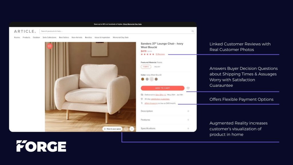
conversion rate optimized product details page from article.com

1. Streamlined Page Layout and Navigation

Help visitors find what they need and stay focused on buying.

  • Clear, minimal navigation (especially on mobile)
  • Prominent product images with zoom and alternate views
  • High-contrast, well-placed “Add to Cart” buttons
  • Avoid distractions that pull users away from the path to purchase

Your site should function like a skilled salesperson—removing doubt and guiding the customer forward.
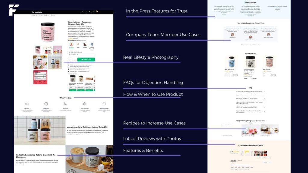
CRO product details page from Perfect Keto example

2. Messaging That Communicates Value

Product pages should persuade, not just describe.

  • Start with a clear, benefit-oriented headline
  • Use concise bullet points that highlight customer outcomes
  • Incorporate reviews, testimonials, and FAQs to build confidence
  • Present unique selling points (e.g., vegan, sustainable, made in the USA)
  • Use video demos, lifestyle imagery, and comparison charts
  • Allbirds Checkout

3. A Checkout Process Designed to Convert

Minimize friction at the final step.

  • Offer guest checkout (no account required)
  • Display shipping rates and delivery timelines early
  • Provide multiple payment options (Shop Pay, Apple Pay, PayPal)
  • Use trust badges and progress indicators

Customers who reach checkout want to buy—don’t give them a reason to leave.

4. Responsive, Fast, and Mobile-First

Design for mobile users first—because they’re your majority.

  • Ensure mobile experience is intuitive and fast
  • Buttons and text should be readable and tap-friendly
  • Avoid pop-ups that disrupt usability
  • Load time should be under 3 seconds (audit with PageSpeed Insights or GTmetrix)


5. Strategic Email and SMS Capture

Don’t let first-time visitors slip away.

  • Use timely, well-designed popups (exit intent, scroll, time-based)
  • Offer first-time visitor incentives (e.g., 10% off, free shipping)
  • Segment messaging based on behavior or product interest
  • Nurture leads with lifecycle flows in Klaviyo or similar platforms

One Click Post Purchase Offers6. Post-Purchase Experience and Repeat Optimization

Maximize LTV through smart follow-up.

  • Display upsell/cross-sell offers on the thank-you page
  • Send personalized post-purchase email flows
  • Ask for reviews and user-generated content
  • Offer incentives for future purchases (subscriptions, rewards, referrals)


Why 3% Should Be the Minimum Benchmark

The industry average eCommerce conversion rate ranges from 1.5%–2%. But high-performing brands consistently reach 3% or more—and in niche verticals, 5–8% is not uncommon.

If your current rate is under 2%, you’re likely experiencing:

  • Higher-than-necessary customer acquisition costs (CAC)
  • Lower return on ad spend (ROAS)
  • Inconsistent revenue forecasting

The good news? Conversion rate is one of the most controllable levers for growth—and improving it compounds your ROI across all channels.

Final Thoughts: Conversion Is About Clarity, Confidence, and Convenience

CRO isn’t just a tactic—it’s a mindset. A conversion-focused brand sees every interaction as an opportunity to remove friction, answer a question, and move a customer forward.

At Forge, we specialize in helping eCommerce brands turn traffic into growth by refining every element of the customer journey—from landing pages and product copy to checkout UX and post-purchase engagement.

Interested in learning where your site could improve?
Book a FREE CRO call here!

0

TL;DR

AI tools like ChatGPT are training shoppers to use longer, more specific search queries that signal higher purchase intent and demand for personalization. Most ecommerce stores still rely on basic search functions while shoppers now expect AI-like interactions with personalized recommendations and dynamic query responses. Upgrading to AI-enabled solutions through Shopify apps like Klevu, Algolia, or Rebuy helps brands capture high-intent buyers. These tools deliver intuitive, personalized experiences that increase conversions, reduce bounce rates, and build customer lifetime value.

Key Points

• Long-tail searches reflect higher purchase intent and demand for personalized results that match exact customer needs.

• AI-enhanced search helps shoppers find relevant items faster, increasing satisfaction and reducing bounce rates through better product discovery.

• Klevu and Algolia provide AI-powered search with real-time indexing, typo-tolerance, and personalized results based on shopper behavior.

• Rebuy boosts average order value through AI-driven product recommendations and real-time upsells during checkout.

• Rich product data with clear descriptions, images, and tags enables AI solutions to deliver accurate and personalized search results.


As artificial intelligence tools like ChatGPT become more common, online shoppers are growing accustomed to richer, more personalized search experiences. This shift in user behavior is driving a new era of extended, long-tail keyword searches and higher expectations around product recommendations. In this blog post, we’ll explore how AI is changing search behavior, why it matters for your e-commerce business, and which Shopify apps can help you tap into this trend to increase conversions and revenue.

The Shift in User Behavior

Longer, More Specific Search Queries

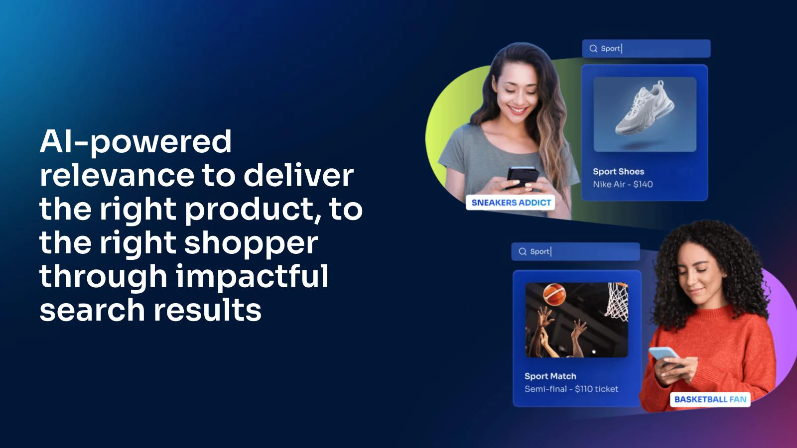
AI-driven search platforms have made it easier for users to ask detailed questions. Instead of typing “shoes,” shoppers now enter queries like “women’s street shoes with stripes” or “eco-friendly running shoes with arch support.” These long-tail searches reflect:

  • Higher Purchase Intent: The more detailed the query, the closer a user is to making a purchase.
  • Desire for Personalization: Shoppers want search results that match their exact needs and preferences.

Expectations of AI-Like Interactions

With the rise of conversational AI tools, many users now expect on-site chatbots to function like advanced AI assistants, offering:

  • Personalized Product Recommendations: Suggesting products based on browsing history, style preferences, or even local weather trends.
  • Dynamic Queries: Responding to follow-up questions in real-time and refining search results on the fly.

Why AI-Enhanced Search Matters for E-Commerce

  1. Improved Product Discovery: Shoppers can find exactly what they’re looking for faster, leading to increased satisfaction and reduced bounce rates.
  2. Higher Conversion Rates: Users who find relevant products quickly are far more likely to add items to their cart and complete the checkout process.
  3. Increased Customer Lifetime Value (LTV): A smoother, more personalized shopping experience encourages repeat purchases and loyalty.

Despite these benefits, most e-commerce stores still rely on basic site search functions or underpowered chatbots. By upgrading to AI-enabled solutions, you can stand out in a crowded marketplace and capture those high-intent buyers.


Top Shopify Apps for AI-Powered Search & Product Discovery

Enhancing your Shopify store’s search capabilities doesn’t have to be complicated. Here are some tried-and-tested apps to boost usability, user experience, and ultimately, revenue.
ai search for ecommerce stores

1. Klevu Smart Search

  • Key Features: AI-powered search and product recommendations, advanced product tagging, and real-time indexing.
  • Why It’s Great: Klevu learns from shopper behavior to deliver personalized results, increasing the likelihood of conversion.
  • Benefits:
    • Instantly updates your product catalog for relevant queries.
    • Provides analytics on search terms and performance.

Check out Klevu Smart Search on Shopify

ai product search for shopify app

2. Algolia Search

  • Key Features: Fast, typo-tolerant, and highly relevant search results.
  • Why It’s Great: Algolia offers instant search capabilities and robust analytics, enabling you to fine-tune your site’s product discovery.
  • Benefits:
    • Lightning-fast autocomplete.
    • Advanced filtering options for precise results.

Explore Algolia Search on Shopify

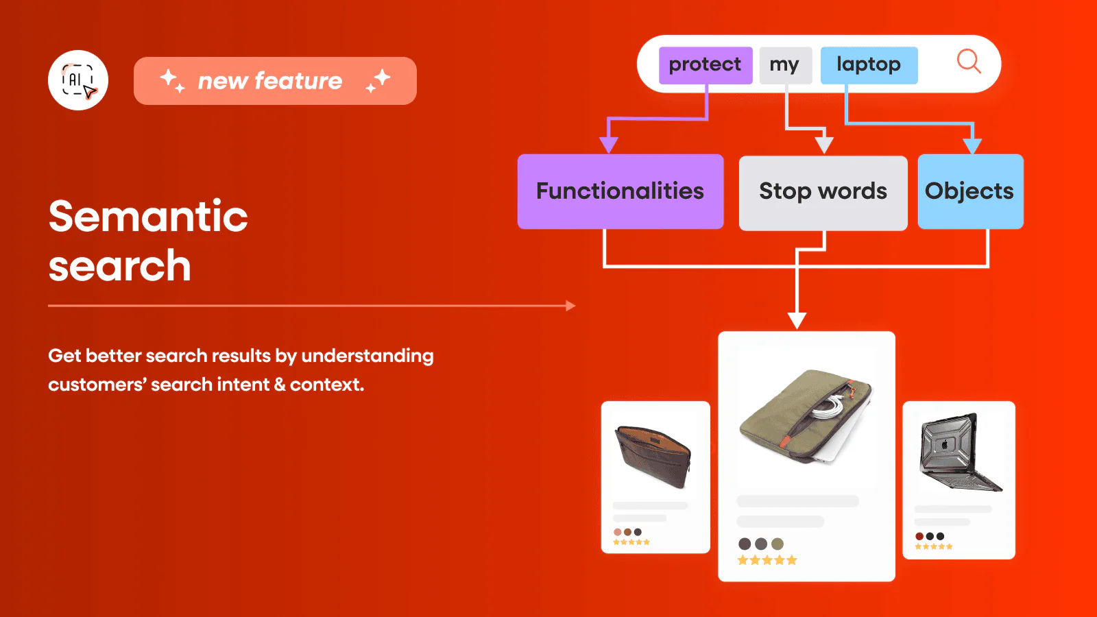
semantic search results for shopify store

3. Product Filter & Search

  • Key Features: Customizable filters and AI-based search functionalities that make it easy for shoppers to refine their results.
  • Why It’s Great: Helps streamline product discovery for stores with large inventories by allowing customers to narrow down options quickly.
  • Benefits:
    • Flexible filters (size, color, price, brand, etc.).
    • Powerful, intuitive interface for both store owners and customers.

Try Product Filter & Search on Shopify


4. Rebuy

  • Key Features: Personalized product recommendations, upsells, and cross-sells driven by AI.
  • Why It’s Great: Rebuy enhances the user experience by suggesting complementary products, boosting average order value.
  • Benefits:
    • Real-time product recommendations based on user behavior.
    • Seamless integration with Shopify checkout to capture last-minute upsells.

Discover Rebuy on Shopify


Best Practices for Implementing AI-Driven Search

  1. Optimize Product Data: Ensure your products have rich descriptions, clear images, and relevant tags. AI solutions rely on quality metadata to deliver accurate results.
  2. Leverage User Data: Use browsing history, demographic info, and past purchases to refine recommendations and personalizations.
  3. Monitor and Iterate: Regularly review search analytics to understand how customers are interacting with your site. Refine and optimize your AI settings accordingly.
  4. Test Different Solutions: Every store is unique. Run A/B tests with different Shopify apps to see which one resonates most with your audience.

Conclusion

As user search behavior evolves in the age of AI, e-commerce businesses that adapt to these changes will thrive. By embracing AI-driven search and chatbot technologies, you can deliver the personalized, intuitive experiences shoppers now expect—leading to higher conversions, improved customer satisfaction, and greater loyalty.

If you’re ready to level up your Shopify store’s search and product discovery features, consider integrating one or more of the AI-driven apps mentioned above. Small investments in this technology can lead to significant growth in revenue and customer lifetime value.

Need Help Implementing AI Search?
At Forge Digital Marketing, we specialize in driving e-commerce growth through cutting-edge solutions. Contact us to learn more about how we can help you optimize your website for the future of AI-driven search.

0

CRO, Marketing, SEO

Do you know why you should pay attention to SEO for law firms? In the competitive landscape of the legal industry, establishing a strong online presence is paramount for law firms to thrive. Transitioning seamlessly from traditional marketing strategies to the digital realm, Search Engine Optimization (SEO) emerges as a pivotal tool in enhancing visibility and attracting potential clients.

Although SEO is technical, time-consuming, and an ongoing process, the goal is straightforward. Boost your law firm’s SEO with the experts to elevate your law firm’s organic search engine performance to one step above using content, backlinks and off-page citations, and technical SEO.

In this ultimate guide, we will explore the various services of law firm SEO, explaining how it can significantly elevate your firm’s online standing. So, let’s dig into the SEO for law firms!


How SEO Can Help You Generate Leads?

In the dynamic landscape of the digital world, law firms cope with the ongoing challenge of lead generation. Search Engine Optimization (SEO) emerges as a crucial tool, akin to a guiding beacon that directs potential clients to the virtual doorstep of legal services. Its strategic implementation involves optimizing the firm’s website for pertinent keywords and crafting high-quality, informative content.

By doing so, attorney SEO marketing for law firms ensures a prominent visibility in organic search results, becoming a catalyst for attracting targeted traffic. This influx of potential clients heightens the probability of converting website visitors into valuable leads, thereby establishing a symbiotic relationship between effective SEO practices and the sustained growth of law firms in the competitive online arena.

However, as the digital ecosystem continues to evolve, the significance of SEO in shaping the client acquisition landscape for law firms remains paramount.

7 Powerful SEO Tips to Boost Lead Generation

SEO Tips to Boost Lead Generation

In the competitive landscape of online marketing, law firms strive to enhance their visibility and attract potential clients. To achieve this, implementing effective Search Engine Optimization (SEO) strategies becomes imperative.

1) Firstly, Begin by Conducting Keyword Research: Identify relevant and high-intent keywords specific to your legal services. This foundational step ensures that your content aligns with the queries potential clients are searching for.

2) Next, Optimize On-Page Elements: Craft compelling meta titles and descriptions incorporating the chosen keywords. Optimize your website’s headers, content, and images to create a seamless user experience while signaling search engines about the relevance of your content.

3) Create High-Quality, Informative Content: Develop content that addresses the legal concerns and questions of your target audience. Regularly updating your blog with insightful articles not only establishes your authority but also attracts organic traffic over time.

4) In addition to content creation, Leverage Local SEO Strategies: Register your law firm on Google My Business, ensuring accurate and up-to-date information. Encourage satisfied clients to leave positive reviews, as these play a crucial role in local search rankings.

5) Furthermore, Prioritize Mobile Optimization: With an increasing number of users accessing information through mobile devices, optimizing your website for mobile is non-negotiable. A mobile-friendly site enhances user experience and positively influences search rankings.

6) Monitor and Analyze Performance: Regularly assess the effectiveness of your SEO efforts using tools like Google Analytics. Identify top-performing keywords, track user behavior, and adapt your conversion rate optimization strategy accordingly.

7) Lastly, Stay Updated with Algorithm Changes: Search engine algorithms evolve, impacting search rankings. Keep abreast of industry updates and algorithm changes to adjust your SEO strategy proactively.

Integrating these SEO tips into your law firm’s marketing strategy will not only boost your online visibility but also enhance lead generation by connecting with individuals actively seeking legal services.

What Services of SEO for Law Firms are Available?

In order to unlock the complete benefits of Search Engine Optimization (SEO), law firms can leverage a diverse range of services customized to suit their specific requirements. This encompasses vital aspects such as meticulous keyword research, meticulous on-page SEO techniques, strategic content creation, and effective link building strategies.

Embracing a holistic SEO strategy becomes paramount for establishing a distinctive presence in the fiercely competitive digital realm. Opting for professional law firm SEO firm service, guarantees that the online initiatives of your law firm seamlessly integrate with your overarching business objectives, fostering enhanced visibility and accessibility.

By entrusting experts in the field, SEO for law firms can navigate the intricacies of search algorithms and stay ahead in the dynamic landscape of online marketing, ultimately establishing themselves as authoritative and trustworthy entities in their legal domain.

Benefits of SEO Services for Law Firms

Services of SEO for Law Firms

SEO for law firms extends far beyond enhancing visibility; it’s a multifaceted strategy that bestows numerous benefits. Beyond mere exposure, it cultivates credibility and trust, positioning your law firm as an authoritative voice in the legal landscape.

By optimizing content and employing effective SEO techniques, your online presence not only attracts but also engages potential clients. The user-friendly experience fostered by SEO for attorneys ensures that visitors can seamlessly navigate your website, establishing a positive impression.

As your digital footprint expands, so does the reach of your firm, resulting in a burgeoning client base and, consequently, sustained growth and success. The strategic implementation of SEO principles is not merely about climbing search engine rankings. It’s about crafting a reputable and influential online identity that resonates with both search algorithms and potential clients alike.

How to Monitor SEO Performance?

In the realm of digital marketing, the efficacy of strategies employed by a law firm hinges on continuous evaluation. Vigilantly scrutinizing the performance of the SEO strategy is paramount, serving as a locking pin for identifying areas of enhancement and leveraging triumphs.

An active approach to monitoring involves the adept use of analytical tools, which facilitate the assessment of keyword rankings and the analysis of crucial website traffic metrics. By harnessing these tools, a law firm can not only stay abreast of its digital presence but also adapt swiftly to the ever-evolving landscape of search engine algorithms.

This proactive approach not only ensures the maintenance of a robust online visibility but also empowers the firm to make data-driven decisions, ultimately amplifying its effectiveness in the highly competitive digital arena.

How Can Your Website Rank in Google?

Securing a prominent position on Google, the pinnacle of SEO achievement, demands a profound comprehension of Google’s algorithms. Navigating this complex landscape necessitates a commitment to optimizing your website’s standing in search engine results.

Regularly updating content with relevance, ensuring a mobile-friendly design, and cultivating a sturdy backlink profile collectively bolster your website’s credibility in the discerning eyes of search engines. These strategies align with the dynamic nature of SEO, where staying ahead of trends is as crucial as mastering the foundational principles.

As the digital landscape evolves, the pursuit of a high Google ranking demands an adaptive approach, blending technical expertise from website optimization strategies to an unwavering commitment to delivering valuable, up-to-date content to your audience.

Navigating the Marketing Mix With SEO

In the expansive realm of digital marketing, law firms face the crucial decision of allocating resources between various channels. Amid the influential roles played by paid advertising, social media, SEO emerges as a distinctive long-term investment.

Unlike the transient nature of paid campaigns, the outcomes of successful SEO strategies persist. So, consistently draw organic traffic and nurture enduring client relationships. However, SEO not only enhances a firm’s online visibility but also establishes credibility and trust, crucial elements in the legal domain.

By optimizing for relevant keywords and creating valuable content, law firms position themselves as authoritative resources within their field. Moreover, paid advertising and social media marketing contribute to immediate visibility. SEO serves as a cornerstone for long-lasting, organic growth, making it an indispensable element in the comprehensive digital marketing strategy for law firms.

Learn more: TikTok Vs Instagram: Which is Better?

Wrapping Up!

In the ever-evolving landscape of law firm marketing, SEO for law firms emerges as the locking pin for success. From generating leads and enhancing visibility to establishing credibility and fostering trust, the benefits of SEO services for lawyers are manifold.

Craft a comprehensive strategy, monitor performance, and stay abreast of industry trends. Law firms can navigate the digital terrain with confidence, ensuring a prominent and enduring online presence.

As you embark on this journey, remember that effective SEO is not just about rankings. It’s about building lasting connections with your audience in the vast digital realm.

0

CRO, eCommerce

When the term “ecommerce” dances across your mind, who steals the spotlight? Undoubtedly, it’s Amazon—the juggernaut of ecommerce! Picture this: Jeff Bezos, in the early days, pondering the pivotal question—how do we catapult our ROI to unprecedented heights? In a blaze of strategic brilliance, Amazon gave a revolution with their game-changing boosting Ecommerce ROI strategies. In 2022, Amazon achieved a global net sales revenue of almost 514 billion U.S. dollars. It marks a testament to the profound impact strategic shifts can have.

Now, here’s the thrilling part—you don’t need to be the next ‘Amazon’ or ‘Flipkart’ to bask in the glory of success. Whether you’re a plucky startup or a seasoned eCommerce enthusiast, a treasure trove of ROI-elevating strategies awaits your exploration.

In this all-encompassing guide, we’re pulling back the curtains on the art of boosting ecommerce ROI, unraveling the metrics of success, and guiding you on a journey to scale your efforts sky-high. Ready to elevate your e-commerce game? Buckle up for an adventure where success knows no limits!

Ecommerce ROI: What is it?

For any e-commerce venture, monitoring return on investment (ROI) is essential for success. The goal is to generate more revenue than the amount spent on marketing and advertising, resulting in a positive ROI. A positive return, signified by anything over 100%, indicates profitability, while anything below 100% represents a loss.

Consider ROI as a litmus test to gauge the efficacy of your marketing endeavors. The funds allocated to marketing and advertising are investments with the expectation of yielding a profit. A higher ROI translates to a broader profit margin.

Illustrating this concept with a non-Ecommerce example, let’s envision a cake bakery. $100 is spent on packaging, a shop window display, and local newspaper ads. By the day’s end, cake sales total $500, resulting in a profit that is four times the initial investment. The calculated ROI in this scenario is an impressive 400%.

Applying this principle to your ecommerce business involves tracking expenditures on marketing, product development, customer service, and other areas, and comparing these costs to the resulting revenue.

How to Calculate Return on Investment (ROI) for Ecommerce?

To determine ecommerce ROI, begin by deducting your marketing expenses from your net profit, which represents total revenue after expenses. Then, divide the outcome by the total marketing expenses figure. To express this as a percentage, multiply the result by 100. The following formula is as follows:

ROI (%)=(Net Profit – Marketing Expenses)/(Marketing Expenses)×100

ROI eCommerce Marketing: 5 Essential Steps

In the fast-paced and competitive world of eCommerce, Return on Investment (ROI) is a critical metric that directly impacts the success of your marketing efforts. Achieving a high ROI requires a strategic and well-thought-out approach. Here are five essential steps to enhance your eCommerce marketing ROI:

1. Understand your Buyer Persona

The foundation of any successful eCommerce marketing strategy lies in a deep understanding of your target audience. By creating detailed buyer personas, you gain insights into the preferences, behaviors, and pain points of your potential customers. This knowledge allows you to tailor your marketing messages, promotions, and product offerings to resonate with your audience effectively. A well-defined buyer persona helps allocate resources efficiently, ensuring your marketing efforts reach the right people and drive meaningful engagement.

2. Implement an SEO Strategy

Search Engine Optimization (SEO) is a cornerstone of successful eCommerce marketing. A robust SEO strategy ensures that your online store is easily discoverable by search engines, driving organic traffic and enhancing your visibility. Keyword research, on-page optimization, and quality content creation are crucial components of an effective SEO strategy. By appearing prominently in search engine results, you increase the likelihood of attracting qualified leads who are actively seeking the products or services you offer. This not only improves your conversion rates but also contributes to a higher ROI.

3. Optimize Website Performance

A user-friendly website is essential for converting visitors into customers. Optimize your website’s performance by focusing on factors such as page load speed, mobile responsiveness, and intuitive navigation. Slow-loading pages or a cumbersome checkout process can lead to high bounce rates and abandoned carts, negatively impacting your ROI. Regularly assess and improve the user experience to create a positive impression, encourage repeat visits, and build customer loyalty. Investing in a responsive design and streamlined user interface contributes to a more efficient sales funnel and, ultimately, a better ROI.

4. Offer Intelligent Product Recommendations

Personalization is a key driver of eCommerce success, and intelligent product recommendations play a crucial role in enhancing customer experience and boosting eCommerce ROI. Leverage data analytics and machine learning algorithms to understand customer behavior, preferences, and purchase history. Use this information to provide personalized product recommendations, upselling, and cross-selling relevant items. By tailoring suggestions to individual customer needs, you not only increase the likelihood of conversion but also enhance customer satisfaction, fostering loyalty and repeat business.

5. Develop a Best-of-Breed Tech Stack

A technologically advanced and integrated ecosystem is fundamental to maximizing your eCommerce marketing ROI. Invest in a best-of-breed tech stack that includes tools for customer relationship management (CRM), email marketing, analytics, and automation. Integration between these tools streamlines processes, enables data-driven decision-making, and enhances overall efficiency. An optimized tech stack empowers you to track and measure the performance of your marketing campaigns, identify areas for improvement, and make informed adjustments to increase ROI.

What is a Good ROI for eCommerce?

The ideal return on investment (ROI) for ecommerce can vary based on factors such as industry, business model, and specific goals. However, a good ROI for ecommerce is generally considered to be at least 5:1 or 500%. In other words, for every dollar invested in your ecommerce activities, you should aim to generate at least $5 in revenue.

It’s important to note that what constitutes a “good” ROI can differ among businesses. Some industries may naturally have higher or lower average ROIs. Additionally, the stage of your business, the efficiency of your marketing strategies, and the competitiveness of your market to increase sales can all influence the perceived adequacy of your ROI.

To assess and determine a good ROI for your e-commerce business, it’s crucial to set clear goals, track performance metrics, and regularly evaluate the effectiveness of your marketing and investment strategies. Benchmarking against industry standards and continuously optimizing your efforts can help you achieve and maintain a satisfactory ROI.

How to Enhance Performance in Your E-commerce Campaigns? 
ecommerce ROI

1) Practice Search Engine Optimization

SEO plays an important role in driving traffic and to take data-driven decisions for your website. Contrary to popular belief, mastering basic SEO is not a complex task. To enhance the search engine ranking of your e-commerce site, follow these steps:

  1. Conduct Keyword Research: Begin by identifying the search terms your potential customers use. The objective is to discover relevant keywords with a high search volume and relatively low competition.

  2. Target Relevant Keywords: Once you have compiled your list of keywords, seamlessly integrate them into your site. Start with product descriptions, page titles, blog posts, and meta descriptions.

  3. Optimize On-Page Elements and Website Structure: While keywords are essential, effective SEO extends beyond them. Ensure your website is user-friendly with a clear and logical structure. Optimize images, use header tags appropriately, and create URLs that accurately reflect your page content.

  4. Enrich Your Website with SEO-Focused Content: Beyond the traditional aspects, create value-driven content such as blogs and guides. This not only provides value to your customers but also aids in ranking for various keywords.

Read more: What is International SEO? 

2) Start Paid Advertising

Now, let’s delve into a strategy that acts as high-octane fuel for boosting ecommerce ROI: paid advertising. While SEO is undeniably crucial for sustained success, paid advertising catalyzes swift victories, establishing a presence, and expanding your audience outreach.

Imagine Pay-Per-Click (PPC) campaigns as the express elevator propelling you to the zenith of search results. Unlike SEO, a gradual ascent up the search engine rankings, PPC places you directly in front of potential customers almost instantaneously.

  1. Choose the Right Platforms: Every platform caters to a distinct user base. Understand your target audience and opt for platforms frequented by them.

  2. Refine Your Targeting: Dive deep into audience targeting. Go beyond demographics and consider factors such as interests, behavior, and purchase intent.

  3. Craft Compelling Ad Copy: Given the fierce competition for attention, make your ads irresistible with clear, engaging copy that directly addresses your audience’s needs.

  4. Optimize Your Landing Pages: Ensure your landing pages deliver on the promises made in your ads and offer a seamless path to purchase.

  5. Test and Optimize: The journey doesn’t end after launching your campaign. Conduct A/B tests on various elements, analyze results, and fine-tune your campaign for improved performance.

3) Use Email Marketing

Instead of broadcasting your products to the vast expanse of the world through paid ads, consider delivering personalized messages directly to the inboxes of engaged customers. When executed thoughtfully, email marketing proves highly effective in enhancing e-commerce ROI.

Well-crafted email marketing campaigns play a pivotal role in guiding potential customers through the sales journey, steering them toward a purchase. Nurturing emails frequently constitutes an integral component of a comprehensive sales funnel, strategically designed for direct conversions.

4) Follow Ecommerce Social Media Strategies

Eager to leverage the potential of social media? Explore these proven strategies:

  1. Organic Content: Capture your audience’s attention with compelling content that narrates your brand story, showcases products, and adds value.

  2. Community Interaction & Groups: Establish a two-way connection with your audience by answering questions and actively participating in discussions. Cultivate a community that feels closely connected to your brand.

  3. Social Media Advertising: Amplify your reach through sponsored posts and ads. Utilize advanced targeting options to precisely reach your ideal customer base.

  4. Influencer Partnerships: Forge collaborations with influencers aligned with your brand to tap into their dedicated audience and expand your reach.

Read more: TikTok vs. Instagram: Which is Better for Your Brand?

5) Measure Ecommerce Key Performance Indicators (KPIs)

  1. Conversion Rate: Gauge the percentage of visitors who complete a purchase on your website.

  2. Customer Acquisition Cost (CAC): Understand the expense incurred to acquire a new customer, revealing the cost of your marketing efforts to attract fresh buyers.

  3. Average Order Value (AOV): Determine the average amount a customer spends when placing an order on your site.

  4. Cart Abandonment Rate: Track the percentage of shoppers who add items to their cart but do not follow through with the purchase.

  5. Customer Lifetime Value (CLV): Predict the revenue a customer is expected to generate throughout their lifetime.

  6. Website Traffic: Monitor the number of visitors to your website, categorized by types such as organic, paid, direct, etc.

  7. Customer Retention Rate: Assess the percentage of customers who continue making purchases from your site over a specific period.

  8. Email Open and Click-through Rates: Measure the effectiveness of your email marketing campaigns by evaluating the rates at which emails are opened and links are clicked.

  9. Social Media Engagement: Evaluate how people interact with your social media content, encompassing likes, comments, shares, and follows.

6) Assess ROI and establish objectives

By the year 2024, global retail ecommerce sales are projected to soar to an astounding $6.4 trillion.

To capitalize on this potential for expansion, it’s imperative to focus on key aspects related to ROI—ongoing monitoring, setting pragmatic and attainable goals, and adapting strategies based on thorough analysis.

Approaches for appraising and overseeing ecommerce ROI include:

  1. Revenue Tracking: Keep tabs on your sales to gain a comprehensive understanding of your business performance.

  2. Cost Tracking: Monitor your expenditures to discern where your financial resources are allocated.

  3. Conversion Tracking: Trace the conversion of visitors into customers to assess the efficacy of your conversion rate optimization strategies.

  4. Attribution Modeling: Gain insights into the effectiveness of different marketing channels in driving sales.

  5. Return on Ad Spend (ROAS): Evaluate the efficiency of your advertising campaigns by comparing the expenditure on advertising to the revenue generated from those ads.

  6. Customer Surveys and Feedback: Obtain direct insights from your customers to comprehend what’s effective and what’s not, which can contribute to your ROI analysis.

7) Expand Your E-commerce Venture

As an e-commerce enterprise hits its rhythm, the moment arrives to accelerate and elevate operations. Scaling empowers you to augment potential revenue and profitability by maximizing successful elements. It’s akin to unlocking the floodgates to usher in a wave of success.

Do You Wish for Boosting Ecommerce ROI For Your Business?

There you have it— connect with Forge Digital Marketing to approach all the top-notch ecommerce services like SEO, PPC, email marketing, social media, and many more. From grasping the fundamentals of ROI, optimizing your website for conversions, harnessing the potential of SEO and PPC, and embracing email marketing, to scaling your business—our professionals will focus on each facet that plays a crucial role in your e-commerce journey.

However, it’s essential to note that merely comprehending these strategies is not enough. The key lies in implementation, experimentation, and refinement based on your data insights. Success in e-commerce demands continuous adaptation and innovation.

The allure of e-commerce lies in its accessibility. So, what comes next? Roll up your sleeves, take action, identify areas for improvement, set goals, and methodically work towards achieving them.

0

Skip to content